Why web accessibility design is more important than you think
How important is accessibility in web design?
When websites and web apps are properly designed and developed, people with disabilities are able to use them with ease. However, there are still many websites and web apps that are not developed with accessibility in mind and make it difficult or simply impossible for certain people to use them. In order to make sure that everyone is able to browse the internet with ease, there are guidelines to ensure that. One of the most important guidelines available is the Web Content Accessibility Guidelines.
What are Web Content Accessibility Guidelines?
The Web Content Accessibility Guidelines (WCAG) are a globally recognised list of recommendations for making Web content more accessible. These guides are here to help identify accessibility problems that are present on your website, and ways to solve or improve them.
What is Accessibility Design?
Accessibility design is designing with accessibility in mind. There are many things to consider when designing for accessibility. There are guidelines that should always be followed in any given situation and some that can be stretched based on usage, purpose and design.
Fundamental web accessibility guidelines for design
Creating perceivable designs

Target: All users
- It is always a good idea to create designs that are perceivable. Create designs for humans, rather than for algorithms or SEO.
- Algorithms are slowly getting better at scanning websites as if they were real humans and they will rank websites higher if the design and build of the website include measures for accessibility.
- Designing in a perceivable way, greatly helps people with disabilities to navigate websites. This is especially true for screen reader users and anyone that relies on systems and devices to help them browse the internet.
- This also means designing in a way that is natural to human interaction and experience. Design with a flow that is natural and comfortable.
- Designs can have a user flow that is natural to everyday life
- This way users who use screen readers can have a clear and easy flow throughout the website.
Semantic HTML
Target: All users
- Semantic HTML is very important for accessibility, as this allows users to skip over contents that they don’t need, and also know where elements are. They also act as landmarks. As the name suggests, it helps users to remember where they are on the page.
- For example, you have a <div> container that acts like a button. Because it is not a <button> tag, screen readers are unable to recognise its function as a button. This will make it much harder for users that rely on screen readers to find the button they want (eg, purchase button, add basket button).
- This applies to headings such as h1, h2, h3, etc. These are landmarks that help users understand where they are on the page, and the importance of the content.
Information and relationships
Target: All users
- Users who are able to see, and perceive structure and relationships through different visual cues –
- Headings are usually larger, with bold font whilst separated from paragraphs by blank lines;
- List items are indented and preceded by a number or bullet point;
- Background colours can be used to indicate items that relate to each other;
- Underlined text meaning links;
- These structures and relationships are programmatically determined/available in the text to ensure that the information is understandable.
- An important example is:
- Users that can’t perceive red, read a price on an item that is red, can still understand it if there is a currency symbol in front of the red price tag.
Text Alternatives
Target: Users with Vision Problems
- Text Alternatives are very simple but fundamental. Whenever there is any sort of non-text content, there should always be a text alternative to describe what it is. This is especially useful for cases such as:
- Users’ internet speeds not keeping up, and non-text content with text alternatives will allow the users to have context on what is supposed to be shown.
- Users’ who have visual impairments with screen readers will be able to understand what the non-text content is.
- Text alternatives should be as descriptive as possible, providing the context and also how the non-text content is meant to be experienced.
- It is one of the easiest accessibility accommodations to achieve, but it is also the most overlooked improvement when adding content to a website.
Foundational Visual Presentation
Target: All users
- Avoid exceeding 80 characters or glyphs per line of text.
- This hugely benefits the reading experience of users of all types, as this reduces the need to move their eyes across the screen.
- Limiting the text width helps people with visual impairments and helps avoid problems like migraines and dizziness from moving the eyes too much.
- Make sure that the text is not justified and that they are aligned to the left or right margins. Centred text is also an option, based on design.
- Touch targets should always have at least 44x44px unless they are part of a sentence.
- You can always add a hitbox around the interactive element if it has less width/height than recommended.
Guidelines to take into account
There are many guidelines that don’t have to be followed completely, but they are useful to keep in mind when designing.
Colour Contrast
Target: All users
- Colour contrast guidelines are very strict, and sometimes they aren’t very realistic. Many times you might find reading text with a certain colour pairing (foreground and background) to be perfectly fine, but fail the contrast test.
- Sometimes calculations don’t work the same way as how our eyes perceive certain colours and elements. There are also certain optical illusions in play that increase contrasts.
- That being said, it is always a good idea to use the guidelines to check if the contrast of the colours you chose is really too weak.
- Including a feature/button to toggle between the intended design to a high-contrast version is a good way to accommodate this accessibility issue.
16px is not equal to 16px
Target: All users
- The value of 16px isn’t always the same as 16px. What this means is that 16px on mobile will not look the same as 16px on desktop.
- When we read, the size of the text is not as important as the image it projects on the retina of our eye.
- Phones are designed to be viewed up close, whilst desktops are designed for viewing farther away. That’s why they seem to have different sizes on different screen sizes, resolutions and viewing distances.
- When it isn’t the same size, 16px on mobile tends to be smaller than 16px on desktop.
- A good way to see if the font size you use isn\’t too small, you can always to check what font-sizes other websites are using. You can also test it out yourself on different devices to make sure.
Animations can cause issues
Target: Users with migraines and seizures
- Animations can sometimes cause problems/pain for users that have seizures or migraines.
- This could be due to the motion of the animation for UI elements or other things that have animations.
- Including a toggle for turning off animations and motion will be very useful for such users.
- Some might recommend designing no-motion first, with an option to switch on animations with a toggle.
- Whether or not to follow such a design approach is completely up to the designer’s choice and target audience.
Designing for magnifying
Target: Users with low vision or vision impairment. Also applies to most users that like to zoom in.
- Users with low vision will zoom in a lot, 200% or even 400% to view the text clearly and comfortably.
- It is beneficial to make sure that the design does not break when it is zoomed in 2-4 times its original size.
If possible, avoid jargon
Target: All users
- Sometimes it isn\’t just about accessibility. Easier words and less jargon help the user understand what the content is about.
- This is especially important for users with disabilities to understand the content since they have less information available to aid their understanding compared to the average user.
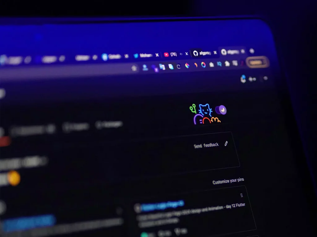
Dark Mode
Target: All users, users with migraines and light sensitivity
- Dark mode is very important for users that might have issues with light sensitivity.
- White backgrounds tend to make it hard for users with light sensitivity to view, and also bright, high-contrast text and background could also cause migraines for certain users.
- Dark mode is a highly supported feature within most modern-day technology from operating systems, websites and applications.
- It is good practice to have an option to toggle dark mode on your website, to allow a more comfortable viewing/browsing experience.
Summary
Web accessibility design isn’t easy to get right but it does come with great benefits that not only help those with disabilities but all users too. but it not only benefits users that have disabilities, but they benefit all users as well. Many accessibility guidelines aim to steer for better human-centred design. Adopting better design philosophy and practice, it will allow the web to be inclusive of everyone. We are committed to providing the best web experience possible, for everyone.
If you have any more questions or are interested in working with us, feel free to contact us and we will be happy to accommodate you.