

A modern refresh with a familiar feel
After speaking with the client, it quickly became clear that there was a lot to like about their existing website, and we didn’t want to move too far away from what they already had.
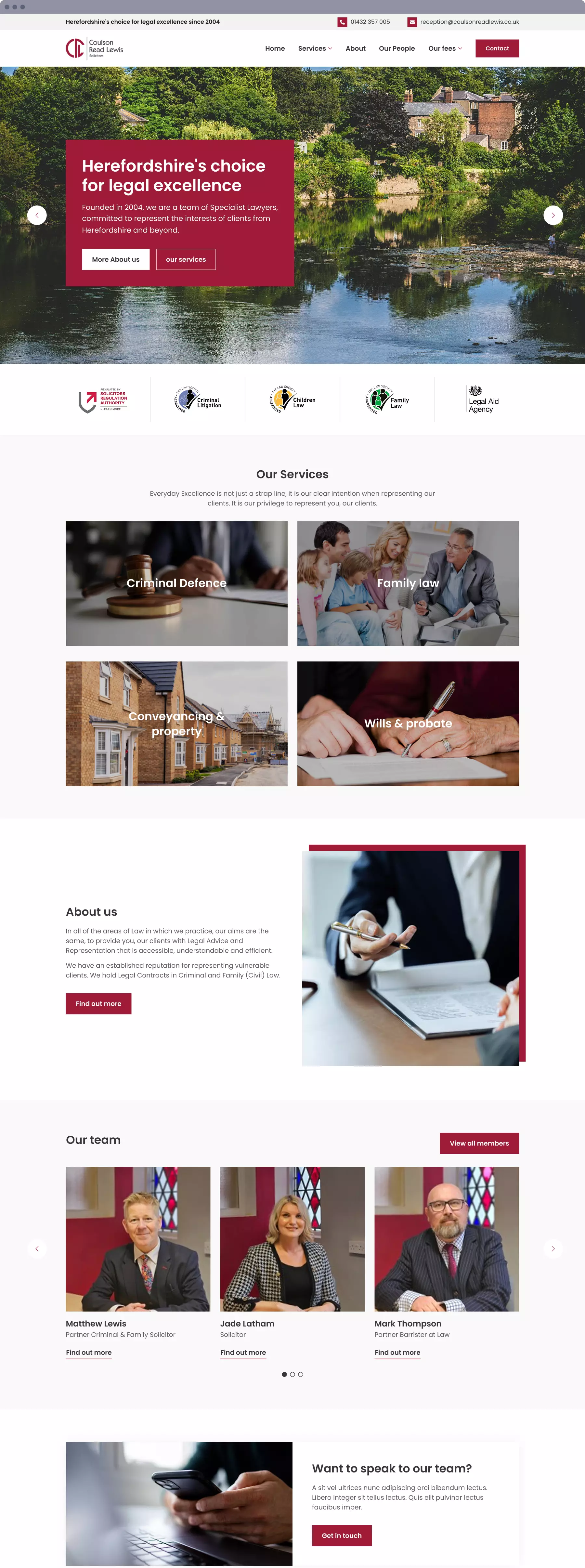
Our goal was to give the current website design a fresh feel while maintaining a sense of familiarity. Visually, this meant making subtle refinements, improving consistency, and introducing a cleaner aesthetic paired with a new, friendly sans-serif typeface.


Enhancing usability with clear, simple structure
During our review of the existing site, one of the first usability issues we identified was the limited access to sub-service pages. These could only be reached by clicking on the parent page in the navigation, with no dropdown to guide users. We addressed this by introducing a two-tier dropdown menu, making the structure more intuitive and accessible.
Another improvement involved the Fees pages, which were previously only accessible via a call-to-action on the homepage. We resolved this by adding a dedicated parent link in the main navigation, complete with a dropdown menu for easier access.
Following discussions with the client, we also took the opportunity to streamline the site by removing outdated pages that no longer served a clear purpose or added value.